.
My First Attempt at LOD Expressions
by Michelle @learnvizwithme
Posted on November 17th, 2018
My First Attempt at LOD Expressions
A couple of weeks ago I was tasked with recreating a data table in a specific format for a report. I thought that the experience was blog worthy and at least allows me to document what I did. Who knows, maybe writing this post will allow me to come up with an even better way as I think through the process. Hopefully, it may also help someone else out there who may be in a similar situation. And if you have a better way of accomplishing this task, I'd love to hear from you!
The original table had been manually created in Excel, and displayed percent distributions and descriptive data in a side-by-side table. I wasn't having any problems creating two separate tables, but putting them side by side into one table was causing me trouble. So I popped onto Twitter to ask for help, and as always the Tableau Community jumped right in. Side note, I really wish Twitter had an edit button. Sorry, @Tableaupublic!
Hello @tableau @tableaupub #TC18 #Data19 friends.
— Michelle Gaudette EdD (@LearnVizWithMe) October 31, 2018
I am being forced to create a cross-tabs chart for a report (ikr...) and I'm not sure how to do the side-by-side aggregation levels (seems basic). Help!
Any instructions or video tutorial links welcome!
Thanks! pic.twitter.com/y8YOzAVsOv
My question on twitter resulted in a few good options, including the use of two sheets on a dashboard and the creation of a crosstabs that could be downloaded, but the one that resonated with me suggested I use LOD Expressions to create the calculations needed to set up the table (Thank you, Jack Hineman & Will Perkins!). I understood basically what LODs were, at that point, but I hadn't figured out how to use them yet.
Once I knew the direction I needed to go, I started looking for information on LOD Expressions, and came across this post by Andy Kriebel, Tableau Tip Tuesday: FIXED Level of Detail Expressions in a Plain English Sentence, that I had actually already read, but wasn't ready to understand at the time. This time though, it was exactly what I needed!
Before I go any further, let me say that I am not an expert in LOD Expressions, and have quite a bit of learning left to do. When I talk about LOD Expressions in this post, I am only referring to this specific example. As I learn more, I'll extend this post to share more.
I've created a clean anonymized data set in order to demonstrate how I created this table, and I've published it on Tableau Public, in case anyone is interested in seeing it for themselves.
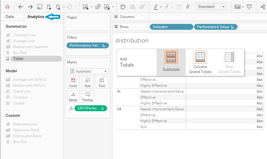
Creating tables in Tableau
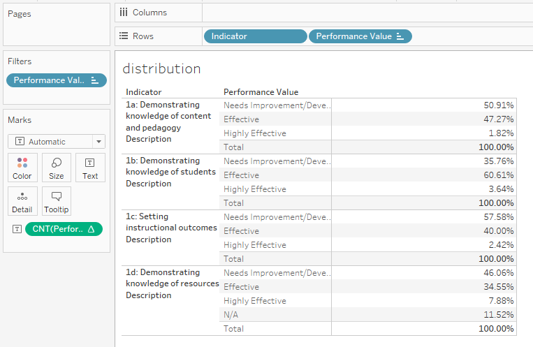
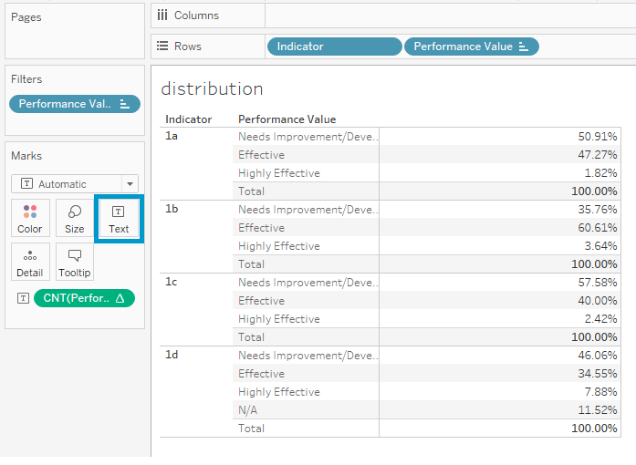
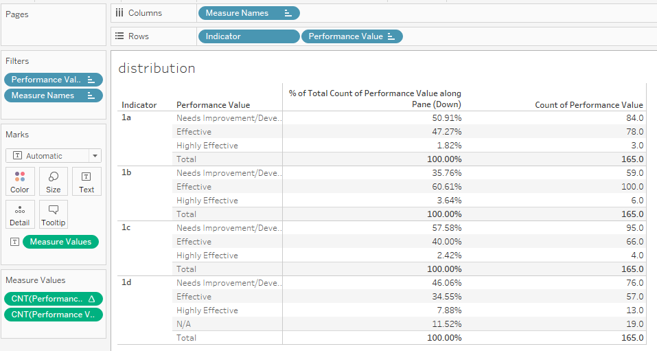
Normally, my tables for percent distributions look like this, as the performance scores are values within the Dimension, Performance Value. ***To see the full-sized images in this post, right-click and open them in a new tab.
Just incase anyone is really new to Tableau, here are the steps to create this table:
- Drag your dimension to the Marks card. In my case, that is Performance Value.
- Click the dropdown carrot on the Performance Value pill (on the marks card), and from the dropdown, select Measure > Count.
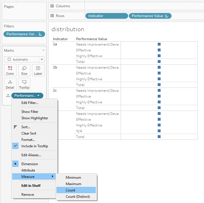
- Click the dropdown carrot again, select Quick Table Calculation > Percent of Total.
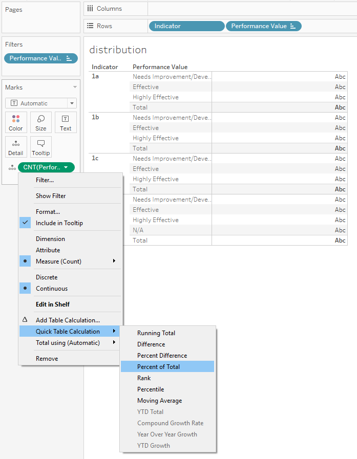
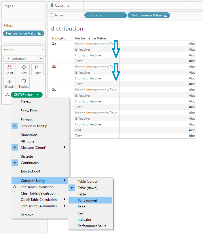
- Click the dropdown carrot once more, select Compute Using > Pane Down. Notice that I want to calculate the percent for each performance value for each indicator and then start over for the next indicator. If I wanted the percent of each performance value for the entire table, I'd choose Table down.
- You probably notice that I have sub-totals in my table. These show me that the percentages add up to 100% where I expect them to.
- To get the sub-totals, click the Analytics tab at the top of your Data pane.
- Click on and drag the Totals to the right and a selection box will appear.
- Drop Totals on the Subtotals selection.
Creating the Table Using LOD Expressions
The format above isn't what I want for my final table. I need the percentages displayed across the columns, not within the rows. To do this I need to create a measure for each percentage, so that I can place my Measure Values on my Text card, and Measure Names on my columns. This will give me a header for each column.
I also want users to be able to filter using parameters, so I need to make sure the filters won't effect my calculations, hence the LODs.
The FIXED Function
The LOD Expression I'll be using is the FIXED function, which allows me to set a calculation at a specific level of aggregation, regardless of the aggregation level that is visible in the view. Using the value Needs Improvement/Developing (score of 2) as an example, here is the formula for my LOD expression:
{FIXED[Indicator] : COUNT(IF([Performance Value] = "Needs Improvement/Developing") THEN
[Performance Value] END)} / {FIXED [Indicator] : COUNT([Performance Value])}
That's a brain-full, so let's break it down in plain English.
For each indicator, count the number of values if they are equal to Needs Improvement/Developing, and then divide that number by the total count of all performance values for each indicator.
Now it took me several attempts to get this right. For two days, I had the entire LOD Expression enclosed in the IF statement, and on my way to lunch one day, it dawned on me that the IF statement was effecting my entire calculation, making it select only the Needs Improvement/Developing for both the numerator and denominator. Ugh...
LOD in Steps
After that realization, to make sure I had each part correct, I actually built the calculation in several steps.
First, I created a calculated field for the denominator, which gave me the total count of performance values for each indicator, again an LOD since I didn't want it effected by the filter.
{FIXED [Indicator] : COUNT([Performance Value])}
Then I created a calculated field for the numerator, which was a bit trickier, because I needed to use an IF statement to only count the number of Needs Improvement/Developing for each indicator. I embedded the IF statement inside the LOD Expression for the numerator, so it wouldn't effect the denominator.
{FIXED[Indicator] : COUNT(IF([Performance Value] = "Needs Improvement/Developing") THEN [Performance Value] END)}
To see the results, I started a new worksheet and put Measure Names on columns, Indicator on rows, Measure Values on the Text card, and removed anything other than the new numerator and denominator measures on the Measure Values card.
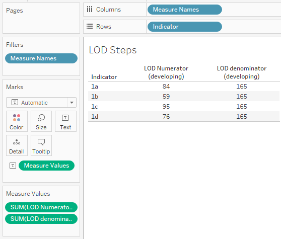
To self-check, I created a table similar to the one I started with above, and added a column to count the number of performance values for each indicator and performance value. The results in my LOD table should match the results in this table. And they do... For indicator 1a, there are 84 Needs Improvement/Developing values and 165 values in total. My final calculation will be 85 divided by 165 = 50.91%.
Putting it all Together
Now if we combine the numerator and denominator calculations into the final LOD Expression, and adjust the IF statement for each possible value, we will have these calculations:
{FIXED[Indicator] : COUNT(IF([Performance Value] = "Unsatisfactory") THEN
[Performance Value] END)} / {FIXED [Indicator] : COUNT([Performance Value])}
{FIXED[Indicator] : COUNT(IF([Performance Value] = "Needs Improvement/Developing") THEN
[Performance Value] END)} / {FIXED [Indicator] : COUNT([Performance Value])}
{FIXED[Indicator] : COUNT(IF([Performance Value] = "Effective") THEN
[Performance Value] END)} / {FIXED [Indicator] : COUNT([Performance Value])}
{FIXED[Indicator] : COUNT(IF([Performance Value] = "Highly Effective") THEN
[Performance Value] END)} / {FIXED [Indicator] : COUNT([Performance Value])}
{FIXED[Indicator] : COUNT(IF([Performance Value] = "N/A") THEN
[Performance Value] END)} / {FIXED [Indicator] : COUNT([Performance Value])}
Resulting in this table.
Descriptive Measures
Next, I created a calculated field to convert the Performance Value strings into numeric values (1,2,3,4) and named that measure Performance Score. Then I created measures for the Distinct Count of the ID, Performance Score Mean, and Performance Score Standard Deviation using LOD Expressions. These LOD Expressions are quite a bit easier, since they are standard calculations.
Distinct Count ID: {FIXED[Indicator] : COUNTD([ID])}
Mean: {FIXED[Indicator] : AVG([Performance Score])}
Standard Deviation: {FIXED[Indicator] : STDEV([Performance Score])}
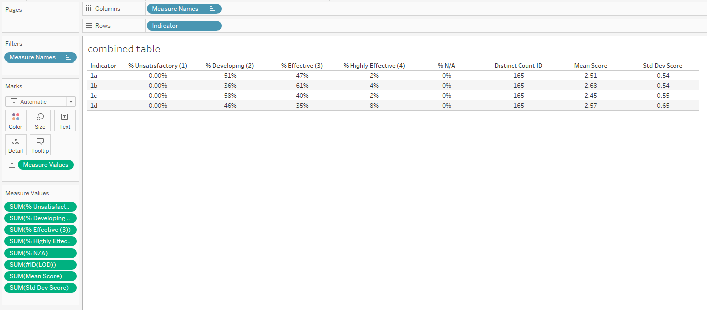
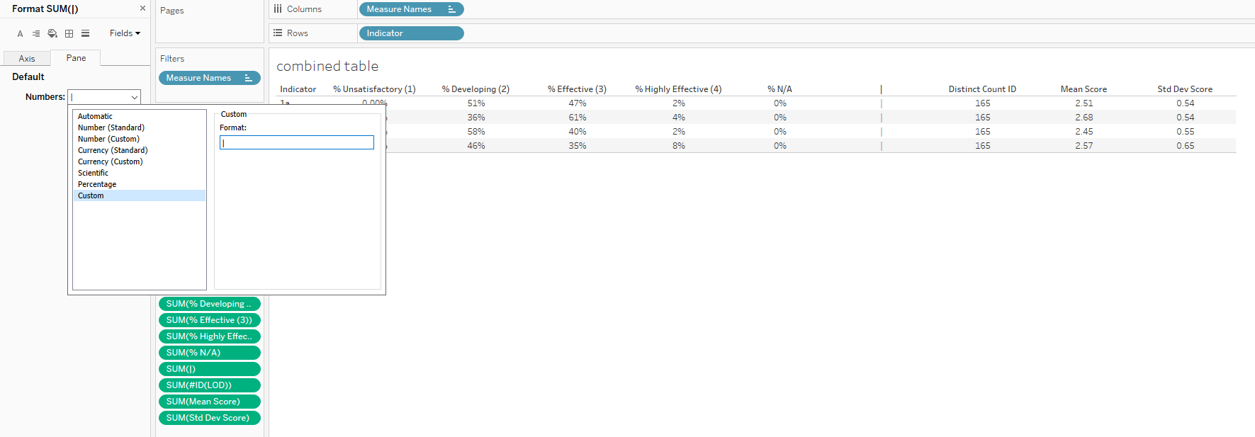
Finally, I wanted to create a space between the percent distributions and the descriptive data, so I created a calculated field with a value of zero, dragged the measure to the Measure Values between the green %N/A pill and the green #ID pill. To make the zeros display as vertical bars, I formatted the number, changed it to Custom and typed | (vertical bar) into the field.
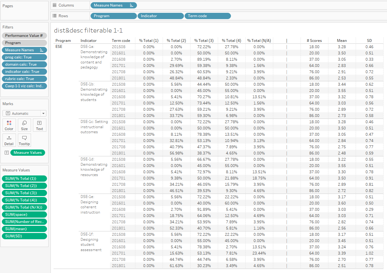
One final note about LOD Expressions. In my actual data set, I was looking at multiple years and academic programs, so I actually needed to narrow my LOD Expressions a bit further, applying several dimensions to each calculation. It was actually easy, and if you remember how to read the statement in plain English, you can easily modify your LOD to accommodate a number of dimensions.
For this table, my LOD Expression would start with {FIXED [Program], [Indicator], [Term code], which in plain English would read as For each program, indicator, and term code...
Right, Wrong, Good, or Bad this is how I created my table.
If nothing else, this was a great opportunity to learn how LOD Expressions work. I feel much more comfortable using them, and am interested to learn more.
Until next time!
Michelle
.
My First Makeover Monday Viz
by Michelle @learnvizwithme
Posted on November 4th, 2018
Makeover Monday
Hello again! This past week, I completed my first Tableau Public visualization for Makeover Monday, and today I wanted to talk about it.
For those of you who may not yet know about Makeover Monday, check it out on Makeovermonday.co.uk. If you want to learn more, you can read this interview with Andy Kriebel and Eva Murray on alexloth.com. You can even listen to Andy Kriebel and Andy Cotsgreave discuss the beginning of the project with Enrico Bertini and Moritz Stefaner on Data Stories.
Basically, each week Eva and Andy provide a data visualization to makeover, the accompanying data set, and if available, an article or website to provide a bit of context. These datasets span a range of topics from gender equality, to global conflict, to avocado prices, and rat sightings in New York and spark some really amazing re-works. The links to the data are maintained on the Makeovermonday.co.uk website, so you can actually go back and see all of the datasets for the past several years.
Once the data are released on Sunday, participants explore the dataset, and can either recreate the original visualization, try to improve on it, or find their own story to visualize. Then on Wednesday, Eva and Andy do a live review session, where they provide feedback on the submissions for that week, so that participants can iterate and improve their work.
This week, I was determined to finish a makeover and publish it on my Tableau Public profile. I succeeded. So now, this blog post is to document my efforts and maybe even give a few hints to those who may still be on the fence about participating.
This Week's 'Crappy' Makeover Monday Topic...
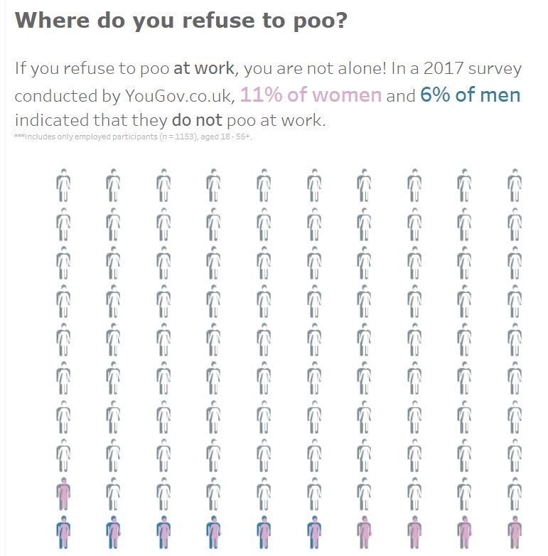
Just kidding... Actually, this week's topic, although a bit disturbing, was actually quite punny, er, I mean funny. The dataset came from a 2017 survey conducted by YouGov.co.uk, in which 2000 participants were asked about their handwashing habits after using the restroom, or for you Brits, the loo. There were two data visualizations in the original article. The first visualization was related to the overall handwashing habits of the participants, and was titled "Men are less likely to wash their hands after going to the toilet."
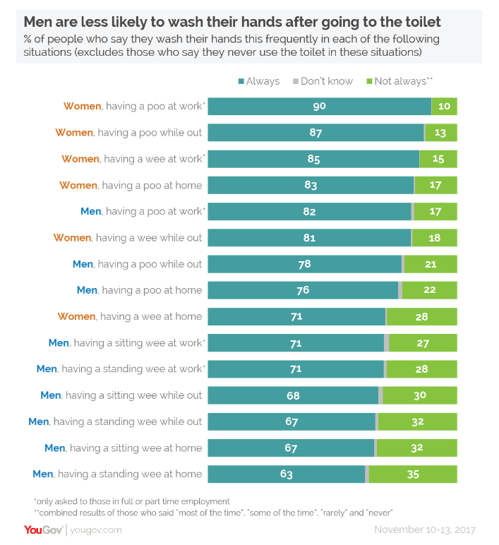
The second visualization in the original article focused on one interesting, and in one case strange, response to the survey questions, and was titled "One in ten women won't have a poo at work or while out and about."
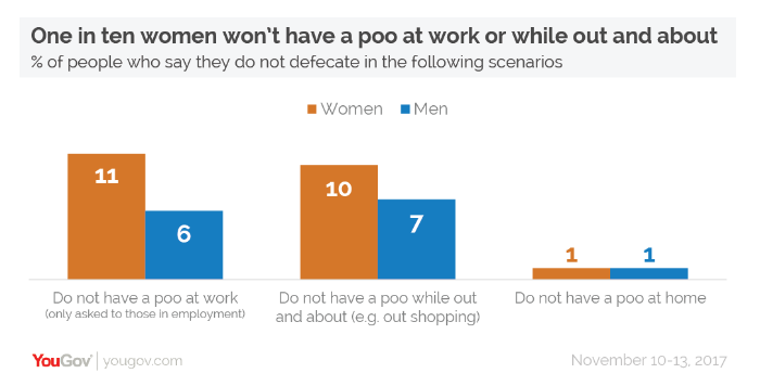
I chose to focus on and re-work the second visualization, because the data intrigued me. The participants were asked how often they wash their hands in various situations, such as at work after urinating, or out and about after having a poo. One response they could give was 'Not applicable - I do not have a bowel movement in this place,' meaning that a percentage of the participants do not poo while at work, or while out and about, or for a small percentage, at home. This one aspect was what I found strange.
I went into this challenge with three goals:
- Clean layout
- Attempt to tell a story
- Try something new
More specifically, I wanted to present these data using a unit chart, aka. waffle chart, which included both the percentages for men and women, in a concise and clean layout. Waffle charts usually only present one specific value, for good reason as they can quickly get hard to read, but I wanted to find a way to combine percentages for both men and women into one chart.
Drumroll please...
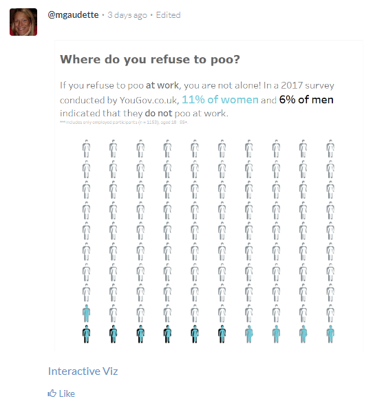
Here is my first Tableau Public visualization, and Makeover Monday submission.
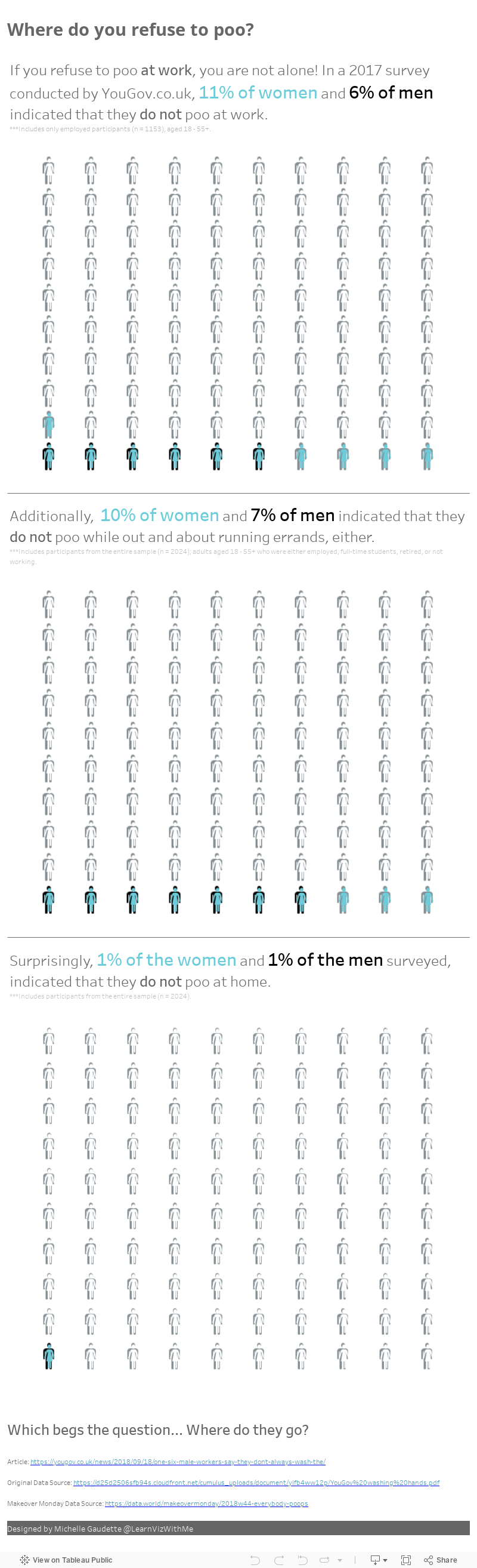
Now, this is the second published iteration. You can see both on my Tableau Public Profile. My first visualization used a light purple and blue *gasp*, and since I realized that could be better, and I wasn't crazy about it anyway, I changed my color scheme to the black and cyan(?). Color isn't my strong suit, but I'm working on getting better.
Tip #1
Done is better than perfect. I am a perfectionist and spend way too much time working on projects, well beyond them being good enough to go out. I am working on that. This week was no different. I was able to get the waffle charts made (more to come on that) and got the visualization to the point where I felt ok about it. I went ahead and published, knowing that I had made a clean visualization that I thought told a story, and I'd successfully combined the two waffle charts. Anything more than that was icing.
Tip #2
If you want to have your visualization reviewed on Wednesday, make sure you have successfully posted it in the correct place. I could have sworn I had mine in the right place, but apparently I just imagined putting it there. No review for me this week. No worries, I watched the review live, which was really fun, and I still learned a ton by listening to the feedback on the other submissions.
In order for Eva and Andy to know to review your submission, make sure that you post it under the Viz Review Discussion in the data.world Makeover Monday discussion for that week, not just the general discussion.
Tip #3
When you post your submission to the Viz Review discussion, Eva has provided a template to help you get it set up correctly. Make sure that you include a static image (jpg, png, etc.) of your submission, in addition to linking to your interactive visualization on Tableau Public or your preferred tool's gallery.
Your post mark-up should look like this (no spaces between the square brackets and parenthesis):
[Interactive Viz](https://public.tableau.com/views/MakeoverMonday1Wheredoyourefusetopoo/Wheredoyourefusetopoo2?:retry=yes&:embed=y&:display_count=yes)
Which will look like this, in your post...
How I created my Waffle Charts
Let me caveat this next part by reminding you all that I am still new to Tableau and data visualization (see my first blog post for more info), and by also saying that I am not claiming that these waffle charts are best practice, or that the way I made them was the best way to do it. I'm sure there are fifty blogs out there that have different and better methods. However, I believe in getting your tasks done using whatever tools and skills you have at hand. If that means you are inelegant at first, so be it. Learn a better way and get more sophisticated as you grow, until then be a hammer if need be. Just get it done.
I learned how to create waffle charts by watching Andy Kriebel's tutorial on Tableau Tip Tuesday, so thank you, Andy! Check out his video if you need to see how to create your waffle charts.
The first thing I did was create a separate waffle chart for percent of men and percent of women who refuse to go poo at work.
- I've connected to both my waffle chart template and to my dataset.
- In his tutorial, Andy converted the columns and rows to dimensions, but I am going to do a dual axis, so I left them as measures. Then from the waffle chart measures, I put the columns on the column shelf, the rows on row shelf, and the numbers on details card.
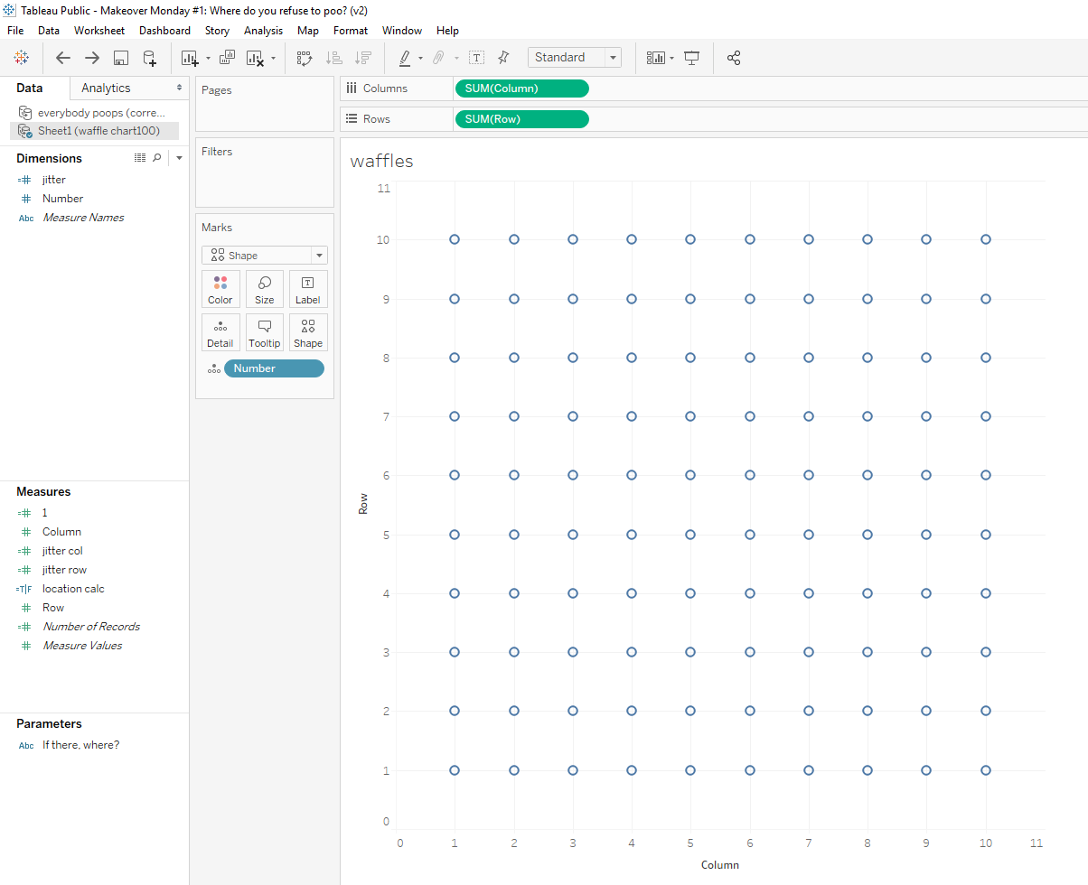
- I then copied the green columns pill on the columns shelf. To copy, hold down the CTRL key while dragging the columns pill beside itself. This creates two grids and two sets of columns cards, one for each columns pill, allowing you to modify the color and shapes for each grid separately.
- I then added the location, 'While at work' and the response, 'N/A' to my filter.
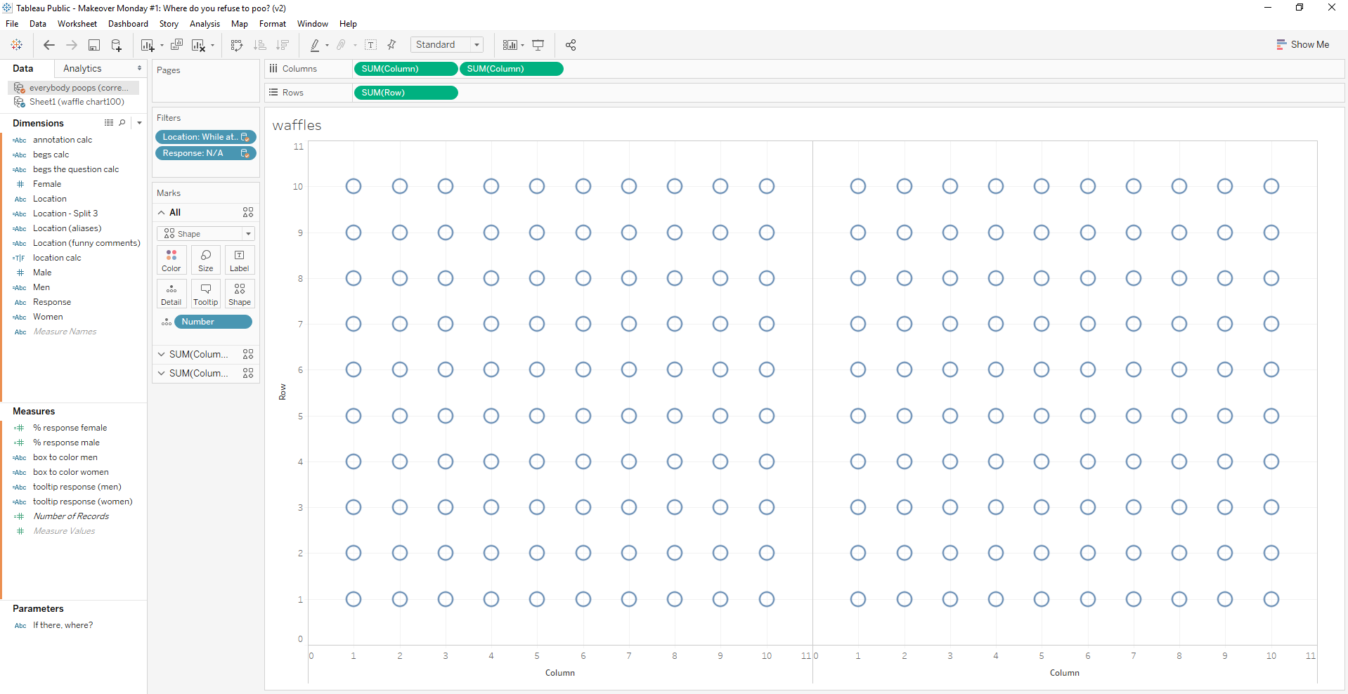
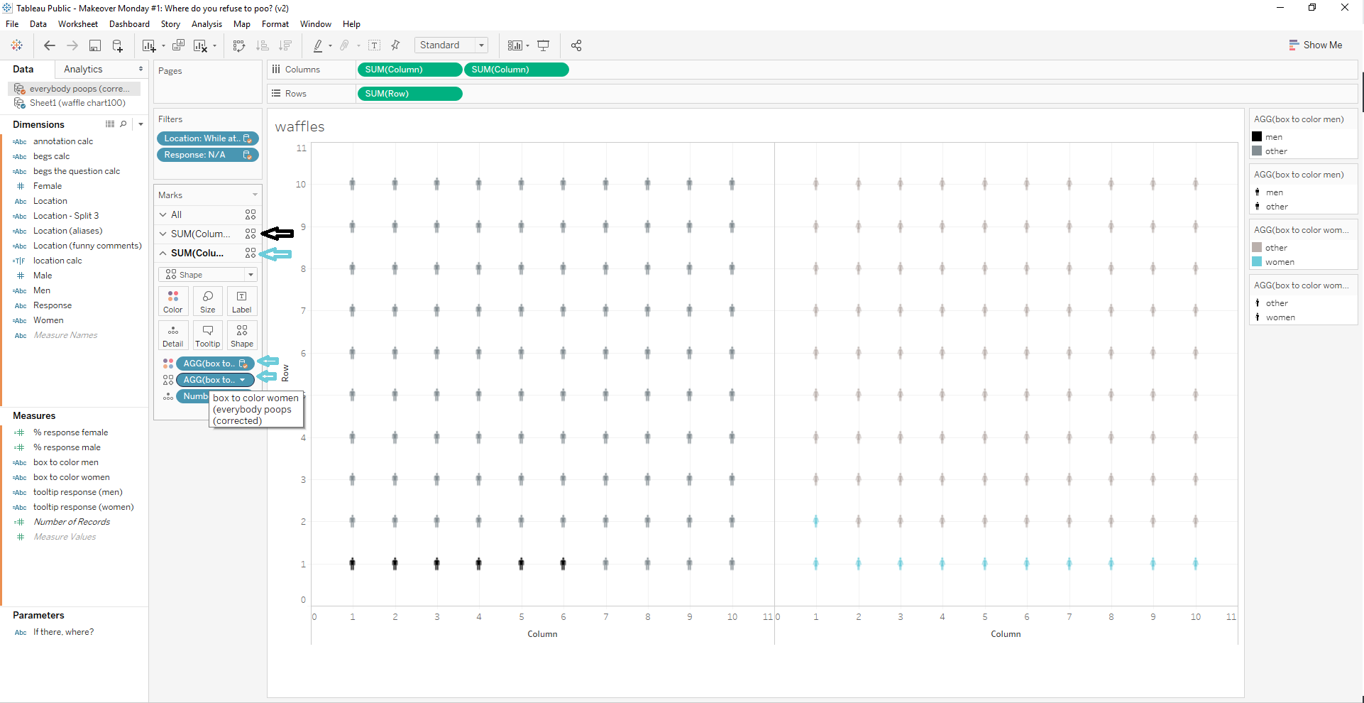
- Next I created the calculated fields, used to color the grid. I created one calculated field for the women and one for the men. See Andy's tutorial for an explanation of how this works.
- I dragged my new calculated fields onto the columns cards on both color and shape. I used the first card for men, and the second card for women. I then selected the shapes from the gender folder in the shapes card, and assigned my colors in the legend. I used black for the men, cyan for the women, and grey for the others (I later changed the female others to white).
Now comes the fun part.
- I created a dual axis chart, by clicking the dropdown carrot on the second columns pill in the column shelf, and selecting Dual Axis from the menu. Then I synchronized the axis (although I'm not sure that it was necessary, but I did it anyway).
- At this point, the figures overlap each other, so you can't see the men behind the women.
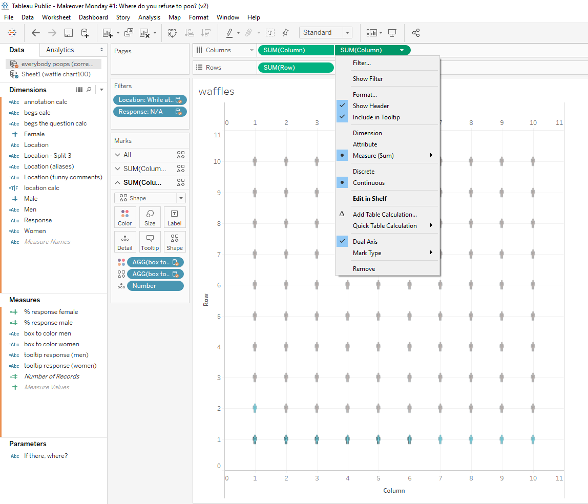
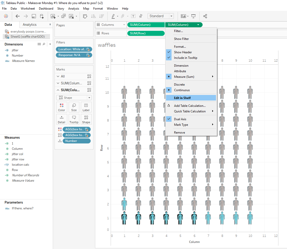
- First I resized them to make the men a little bigger than the women, since they were in back.
- Then I offset the women, so they would be a little off to the right. To offset the women, I clicked on the dropdown carrot on the second columns pill, and selected Edit in Shelf.
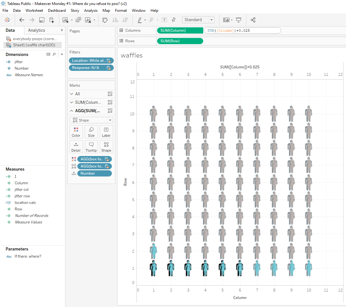
- This part took a little trial and error. Basically, when I selected Edit in Shelf, the columns pills looked like this: SUM([Column]), and I just added "+0.025" to the end, SUM([Column])+0.025. It took a few tries to find the right number, because 0.5 pushed the image too far to the right, and 0.01 wasn't noticable, but somewhere inbetween worked out just fine.
That's it! I just repeated the steps for each of the locations I was presenting, changing the filters accordingly, and then I created my dashboard.
I hope you found this explanation helpful, or that maybe it got you thinking of another way to solve a problem you might be having.
I'd love to hear about some challenges that you've worked around.
Until next time!
Michelle
.
The Amazing Tableau Community at TC18
by Michelle @learnvizwithme
Posted on October 27th, 2018
Hello! My name is Michelle, and I am starting this blog as a way to document my data visualization journey. I just returned from my first Tableau Conference and realized that my experience at the conference was so impacted by the Tableau Community, that I wanted that impact to be the topic of my first blog post. Now if you've met me, you know that I am a bit excitable, and when I'm excited I can get quite chatty. I am going to work hard to keep the word count to a minimum, at least in this first post.
A Little About Me
I have been teaching in the teacher preparation program at the University of West Florida in Pensacola, Florida since 2006, and prior to that I taught high school science for several years. I took numerous quantitative analysis courses in my doctoral program, and my dissertation included both qualitative and quantitative data analysis. I enjoyed the research, but wasn't all that interested in quantitative data analytics, which I never felt was presented as a dynamic and exciting field. I completed my doctorate in 2011 and then completed two additional master's degrees in Instructional Design in 2015 and Biology in 2016. After the completion of my doctorate, I continued my non-research teaching position, and other than the data analysis I did for my own course improvement, I didn't do much additional research.
Fast forward to the end of 2017, when I came across the term 'data science'. I realized that problem solving, a skill I do all the time, was really the goal of the analysis that Data Scientists do. The only hiccup was that I knew I was going to have to learn Python, SQL, and several other programming languages, and I am not yet a programmer. Regardless, I started learning a little Python and immersing myself in blogs and podcasts.
In 2018, I was asked to take on an analysis role to assist the accreditation efforts of our teacher preparation program. So, in May of 2018, I began analyzing program data using the only tool I had at hand, Excel. I'm sure you can all imagine and sympathize with how much fun I had in my first month as an analyst. Luckily, the Universe was listening and around the same time, I started binging on the Data Stories podcast, hosted by Enrico Bertini and Moritz Stefaner. They presented data in a way that I had never experienced before. For the first time, data were exciting and beautiful. Their podcast was also the first time I heard about Tableau and the ease with which it allows you to analyze and visualize data.

My Introduction to Tableau
I installed the 14 day trial version of Tableau Desktop on June 27th. Two hours later, I enthusiastically showed my project manager how I had recreated the charts I'd just spent weeks creating in Excel. As an added bonus, the Tableau charts had the ability to dissagregate on the fly and drill down to the row-level data, something I hadn't been able to do in Excel. I was hooked.
I immediately requested that we purchase the Desktop license with Tableau Server, so I could publish and share out with faculty, and found out that the University already had a license. I switched over to the University license and was given publishing rights on our Tableau Server. All I had left to do was learn how to use it. I spent weeks digging around on the internet looking for blog posts and video tutorials, and I spent evenings and weekends binge-watching every video tutorial I found.
My Welcome to the Tableau Community
I soon realized that there were people talking about Tableau and sharing resources on Twitter, so at the end of July, I joined Twitter and followed as many Tableau and Data Viz people as I could find. Eventually, I found Tom Brown, Founder of The Information Lab UK, and on September 6th, he messaged me to thank me for being his 3000th Twitter follower. What came next was nothing short of amazing!
Tom posted on Twitter asking the Tableau Community to follow me...
Can I get some #tableau follows for new tableau fan @learnvizwithme, she’s trying to find the community.
— Tom Brown (@_tombrown_) September 6, 2018
I didn't get a screenshot, so you'll have to trust me on this next part. I went to bed with maybe two followers, and woke up the next day to something like 150! I was blown away. The tweets just kept coming, all welcoming me to the community.
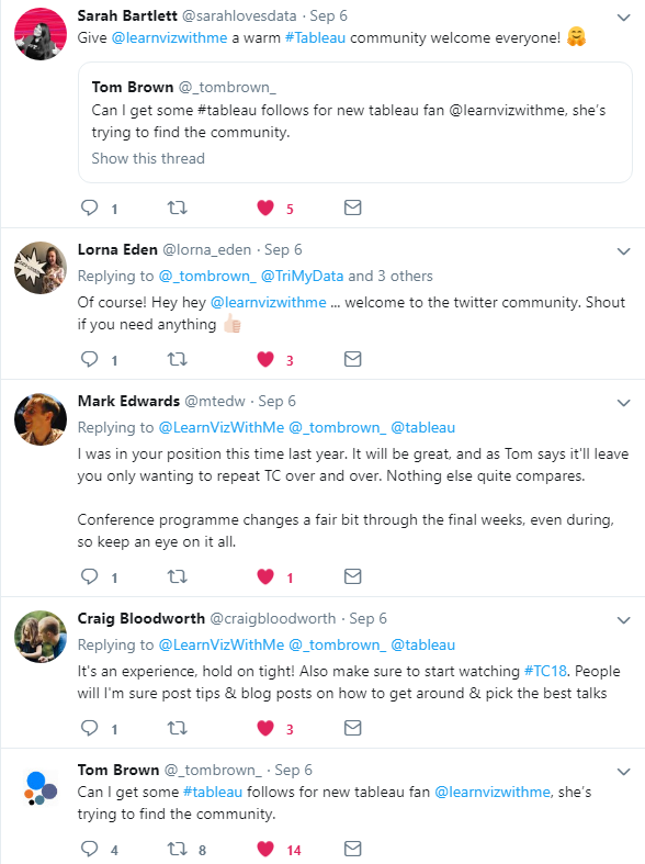
Tom opened the door, invited me in, and introduced me to his Tableau family. And holy cow, what a welcome.
And then, this happened...
Hey everyone! I think @_tombrown_ may have discovered one of the most excited people to join the Tableau Community in a while. Give @LearnVizWithMe a follow and show her the Tableau family love. AND she's coming to TC!
— Andy Kriebel (@VizWizBI) September 7, 2018
I'm sure many of you have had a similar experience to this, but I felt like I knew Andy Kriebel, because I'd spent hours watching his tutorials and reading his blog. So I was super excited when he retweeted Tom's post.
Now, not only did I have a great community to lean on as I learned, they were looking for me at the upcoming conference!
My Reflections on TC18 in New Orleans, LA
As I said at the beginning of this post, I've just returned home from my first Tableau Conference, which I'm sure would have been amazing even if I hadn't known so many people beforehand, but the fact that I did made my experience so much richer!
#Tc18 - It was awesome to chat with @paulbanoub and @Nelsondavis before Ironviz pic.twitter.com/kptqJuEc8F
— Michelle Gaudette EdD (@LearnVizWithMe) October 25, 2018
I arrived on Sunday, picked up my badge and walked, with about twenty other conference attendees, to the Catahoula Hotel for the Data+Women pre-conference event, where I ran into Emily Chen, from The Information Lab, another amazing person I've met through Tom.
#TC18 #IronViz @echenty @Schofe23 pic.twitter.com/zAR8dtJ3EW
— Michelle Gaudette EdD (@LearnVizWithMe) October 24, 2018
Emily started introducing me to people, and Sunday night I met many of the people I had met in the Tableau Twitter Community. And... I finally got to meet Tom and Andy in person.
There are few things more fun than connecting w/ your data family at #TC18. Thanks @tableau for another incredible conference. Year after year, you outdo yourselves. I especially love meeting people that are at TC for the first time. I'm glad we help them feel the Community love. pic.twitter.com/dl93k5ljf8
— Andy Kriebel (@VizWizBI) October 25, 2018
Over the next four days, I met even more people, and I attended the Desktop II training, where I realized I knew more than I thought and learned some really great new information; two Hands-on-Trainings where I learned more about dashboard interactions, and blending data sources; and as many breakout sessions as I could run to (seriously that conference center is HUGE!). I'm pretty sure several of my next blog posts will be the result of what I've learned at TC18.
I had my mind blown at the Welcome Reception...a parade? Seriously?
Welcome to #tc18 #nola #parade! 5 minutes is a long time to hold up your phone! pic.twitter.com/C44kot80KS
— Zac Woodall (@Mystic_TaCo) October 22, 2018
Then my mind was blown again at Iron Viz.
Got this photo of @TimothyVermeire’s first reaction to picking up the #IronViz W. Congrats sir! #TC18 pic.twitter.com/TQ52up2HDi
— Luke Stanke (@lukestanke) October 27, 2018
By the time I arrived at the Superdome for Data Night Out, I just couldn't get any more overwhelmed (there are just no words...).
Best. Data Night Out. Ever. Period. #TC18 @tableau pic.twitter.com/xppPhi6EKj
— Nelson Davis (@Nelsondavis) October 25, 2018
Honestly though, the most valuable aspect of the conference is the new friends that I have made.
#IronViz baby! @ktfontnowagner @sonarstrange pic.twitter.com/OOEiqoRGlF
— Michelle Gaudette EdD (@LearnVizWithMe) October 24, 2018
I was truly sad to leave, but I know that I have a community on whom I can lean while I learn. And as I learn I want to grow and strengthen my community, because I want to be able to provide for others what has been provided for me.
What's To Come?
With this first blog post, I pledge to be an active member of the Tableau Community, therefore I am setting five main goals for this upcoming year:
- Spend one hour per day learning about Tableau. I will dedicate one hour per day to learning something new in Tableau. I will add it to my schedule to make sure it becomes part of my normal routine.
- Maintain the Learn Viz With Me blog. I will document my journey by writing about the knowledge and skills I learn. My blog posts might not be nobel prize worthy, but big or small I will put them out there to solidify my own learning, and if they are helpful to others, bonus.
- Build my Tableau Public Profile. I will push past my fear and post my work on Tableau Public. Regardless of how good or how done I think my work is, I will put it out there, get feedback, and demonstrate progress.
- Participate in Makeover Monday. I need some structure to help me keep going, so even if I am late posting, I will participate in Makeover Monday each week. By this time next year, I expect to have completed at least 52 projects.
- Stay in touch with my Data Family. No matter how busy I get, I will stay active on Twitter, keep in touch with the new friends I've made at TC18, and pay it forward to new members of the Tableau Community.
Until next time!
Michelle